

7 Cardboard Display Ideas for Pharmacies and Drugstores?
Cardboard display ideas for pharmacies and drugstores can easily look creative on paper but fail in the aisle. A shopper may feel rushed, unsure, or skeptical. If the display does not explain the product quickly and stay stable in-store, the promotion loses value. I use these seven ideas to match the display format with the real pharmacy buying task.
The best cardboard display ideas for pharmacies and drugstores are not just about shape. They should match shopper intent, product education needs, store location, shelf load, stability, and in-store setup. Strong options include educational floor displays, seasonal endcap displays, counter displays, hook displays, narrow aisle towers, refill-focused shelf displays, and compact SKU grouping displays.
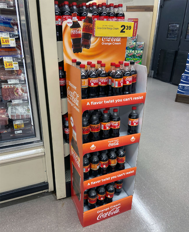
Pharmacy and drugstore displays are different from general supermarket displays. Shoppers often want trust, clarity, and fast product understanding.1 In real projects, I always look at product weight, packaging size, usage cues, store space, and assembly risk before recommending a structure.
How Can Educational Cardboard Display Ideas Help New OTC Products?
New OTC products often need more explanation than snacks or household goods.2 The problem is that shoppers may not understand the benefit in three seconds3. If the design only looks bright, it may create attention but not confidence. A clear educational cardboard display can solve this gap.
An educational cardboard display works best for new OTC, wellness, supplement, and personal care launches. It should use a clean header, simple benefit zones, clear product grouping, and enough space for usage information that the brand and retailer have already approved.
In pharmacy projects, I usually treat education as a structural and visual planning issue, not only a graphic design issue. The display should answer three shopper questions quickly:
- What is this product?
- Who is it for?
- How should I compare the options?
Best-fit product types
This format works well for:
- New OTC launches
- Vitamins and supplements
- Allergy, cold, and flu support products
- Pharmacy beauty products
- Oral care or skin care with multiple benefits
Ideal store location
The best location is usually a pharmacy aisle entrance, near a related category, or beside an endcap where shoppers can pause. I would avoid placing a high-information display in a very tight checkout area because shoppers may not have time to read.
Structural considerations
For educational displays, I often recommend:
| Element | Practical reason |
|---|---|
| Tall header card | Improves visibility from a distance |
| Tiered shelves | Helps shoppers compare product variants |
| Side panels | Adds space for simple education points |
| Strong base | Reduces tipping risk when shoppers pick up products |
| Matte or clean print finish | Supports a pharmacy-style trusted look |
The structure must still be easy to manufacture and ship. A beautiful display with too many small panels can become hard to assemble in-store. Before choosing this idea, brands should confirm retailer rules for product claims, approved wording, and placement. I can guide the display structure and print execution, but medical or compliance language should always be verified by the brand and retailer.
Why Are Seasonal Cardboard Display Ideas Useful for Pharmacy Promotions?
Seasonal pharmacy promotions move quickly. The problem is that cold, flu, allergy, sun care, and holiday wellness campaigns have short selling windows4. If the display arrives late, damages in transit, or takes too long to assemble, the best season may already be gone.
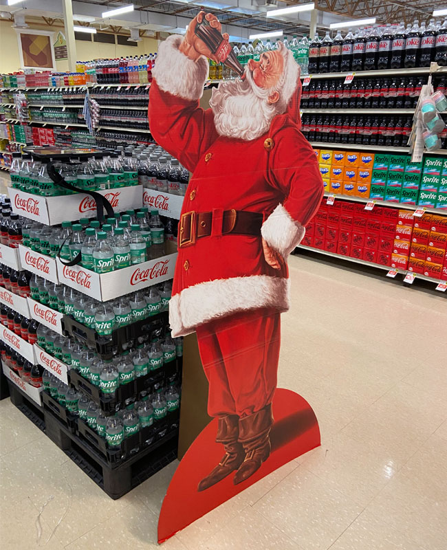
Seasonal cardboard display ideas work best when they are simple, strong, and fast to execute. A seasonal floor display or endcap-style display should highlight the occasion, group related products, and use a structure that protects stock during shipping and setup.
![seasonal cardboard display ideas for pharmacy promotions]https://justcardboarddisplay.com/wp-content/uploads/2026/06/Coca-Cola-Drinks-Mini-Case-Stacker.jpg "Seasonal cardboard display for drugstore promotion")
In real production projects, seasonal displays need stricter timeline control than evergreen displays. The design may look simple, but the execution risk is high because timing matters.
Best-fit product types
Seasonal pharmacy displays are suitable for:
- Cold and flu products
- Allergy care
- Sunscreen and after-sun care
- Travel-size personal care
- Holiday wellness packs
- Back-to-school hygiene products
Ideal store location
These displays usually perform best near the front aisle, pharmacy walkway, seasonal zone, or category entrance. A brand should ask the retailer where seasonal traffic naturally flows. A pharmacy display should not block movement or create a cluttered feeling.
Structural considerations
A seasonal display often carries many units, so shelf load is important. I normally check:
- Product weight per facing
- Total display load
- Shelf span and paper strength
- Base footprint
- Anti-tilt design
- Transit packaging
- Store assembly steps
For example, a sunscreen display may use lightweight tubes, while a cold medicine display may include small cartons with higher total quantity. These two displays may look similar, but the shelf engineering can be different.
Execution risk
The main risks are late delivery, weak shelves, and complex assembly. I prefer designs that can be packed efficiently and opened quickly by store staff. If a display needs more than a few clear steps, the chance of incorrect setup increases.5
A good seasonal display should balance promotion and discipline. It should feel timely without looking chaotic. In pharmacy and drugstore environments, clean colors, clear category messaging, and simple product blocking usually work better than overly loud decoration.
Which Cardboard Display Ideas Work Best for Impulse Purchases?
Impulse purchases in pharmacies are different from impulse purchases in supermarkets.6 The shopper may still care about trust and usefulness. If a display feels messy or unclear, the shopper may ignore it. A small, focused cardboard display can make low-risk add-on products easy to notice.
Counter displays, small dump bins, and mini floor displays work well for pharmacy impulse purchases. They should hold small, lightweight products, use simple messaging, and sit near checkout, prescription pickup, or high-traffic personal care areas.
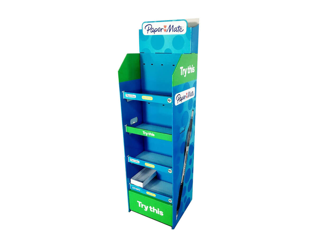
Impulse display planning starts with product behavior. I ask one question first: Can the shopper decide quickly without heavy explanation? If the answer is yes, a compact impulse display may work.
Best-fit product types
Impulse formats are useful for:
- Lip balm
- Hand sanitizer
- Trial-size skin care
- Travel packs
- Eye drops
- Small personal care items
- Single-pack wellness accessories
Ideal store location
The strongest locations are checkout counters, service counters, pharmacy pickup zones, and queue areas.7 However, countertop space is limited. The display must earn its space with a tight footprint and simple product access.
Structural considerations
A counter display needs different engineering from a floor display. It must be light, tidy, and stable. In my experience, brands should confirm:
| Item | Why it matters |
|---|---|
| Counter footprint | Retailers may restrict size |
| Product access angle | Shoppers should pick items easily |
| Back panel height | It must not block staff visibility |
| Unit count | Overstock can make the display look messy |
| Shipping protection | Small displays can crush if poorly packed |
Execution risk
The biggest risk is overloading the display. A counter unit may look fine in a sample room, but it can bend after holding product for several weeks. I often recommend testing the display with real product weight before mass production.
Impulse displays should not try to explain everything. They should make one clean promise, such as convenience, travel, daily care, or quick relief. Any medical or regulated claims should be checked by the brand and retailer before printing.
Can Replenishment-Focused Cardboard Display Ideas Support Everyday Products?
Everyday pharmacy products need easy replenishment. The problem is that high-turnover items can make a display look empty or disorganized8. If staff cannot refill it quickly, the display loses shelf impact. A replenishment-focused cardboard display keeps product access and restocking simple.
Replenishment-focused cardboard display ideas work best for daily-use products with repeat purchase behavior. The structure should use clear shelf rows, strong dividers, visible SKUs, and enough capacity to reduce frequent restocking without making the unit too heavy.

For replenishment displays, I focus less on visual drama and more on store operation. A display that looks clean after two weeks often performs better than a display that only looks impressive on launch day.
Best-fit product types
This idea works well for:
- Toothpaste and oral care
- Vitamins
- Pain relief cartons
- Feminine care accessories
- First aid items
- Skincare basics
- Personal hygiene products
Ideal store location
The display should sit close to the related aisle, not far from the category.9 For example, oral care should stay near oral care. This helps shoppers trust the display as part of the normal buying journey rather than a random promotion.
Structural considerations
Replenishment displays need strong shelf discipline. I usually look at:
- Shelf height by SKU
- Number of facings
- Product depth
- Divider strength
- Front lip height
- Refill access
- Carton packing sequence
Practical example
If a brand has four vitamin SKUs, I may suggest a four-column display with clear vertical separation. This reduces mixing during store handling. If each SKU has different packaging color, the display can use that visual system to help shoppers compare quickly.
Execution risk
The main risk is shelf sagging. This happens when a shelf is too wide, the paper grade is too light, or the product weight is underestimated. Before production, I prefer to confirm real product dimensions and loaded weight. For heavier cartons or bottles, a reinforced shelf or smaller shelf span may be needed.
Replenishment displays should also be easy to ship. If a display ships pre-packed, the outer carton and internal protection must be strong enough for overseas delivery. If it ships flat, the assembly instructions must be clear for store teams.
How Do Counter Recommendation Displays Build Trust in Pharmacies?
Counter recommendation displays sit close to staff and high-intent shoppers. The problem is that this area can feel sensitive. A display that looks too aggressive may reduce trust.10 A clean counter recommendation display should support simple product discovery without making unsupported claims.
Counter recommendation cardboard displays are best for small products that need visibility near checkout or consultation areas. They should use restrained design, clear product names, neat facings, and retailer-approved messages. The format should not block staff work or customer interaction.
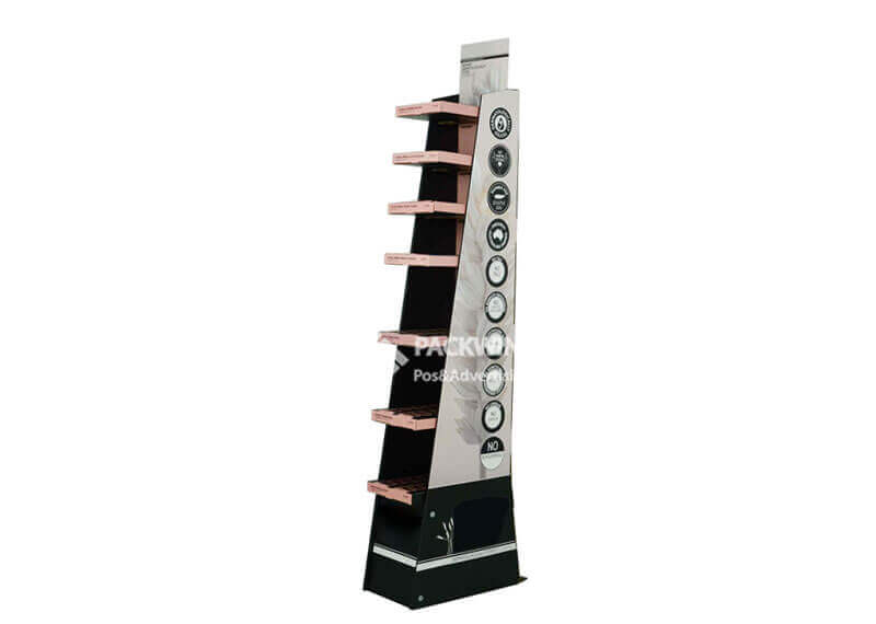
I treat pharmacy counter displays carefully because the space is valuable. A brand may want maximum visibility, but the retailer often wants order, safety, and easy service.
Best-fit product types
This display idea can fit:
- Small OTC cartons
- Lozenges
- Lip care
- Hand cream
- Eye care accessories
- Trial or sample-size products
- Health and beauty add-ons
Ideal store location
The best location is usually the checkout counter, pharmacy counter, or service desk. However, each retailer has its own rules. Brands should confirm permitted display size, message type, and product category before design approval.
Structural considerations
A counter recommendation display should be compact and stable. I usually recommend:
- A low center of gravity
- A back card that is not too tall
- Clean front product visibility
- Strong side walls
- Simple product loading
- Rounded or tidy exposed edges where possible
Execution risk
The biggest issue is space conflict. If the display is too wide, staff may remove it. If it blocks payment devices or service areas, it may never reach the counter. A smaller display with good product discipline can be more effective than a larger one that irritates store teams.
In one type of project I often see, the brand wants a tall back panel for messaging. I usually ask them to check sightline and counter rules first. A pharmacy display should feel helpful and professional. It should not create pressure or confusion for shoppers.
Why Should Aisle Visibility Cardboard Display Ideas Stay Clean and Simple?
Aisle visibility is important because pharmacy shoppers often move with a specific task. The problem is that too many messages can slow recognition11. If the display looks crowded, shoppers may not stop. A clean aisle display helps the product category become visible without visual noise.
Aisle visibility cardboard display ideas should use a tall header, strong color blocking, clear category words, and a stable base. This format works best for brands that need to stand out in a crowded aisle while still looking organized and trustworthy.

Aisle displays often compete with fixed shelves, signage, and other promotions. I usually advise brands to make the message shorter, not louder.
Best-fit product types
Aisle visibility displays work well for:
- Pharmacy beauty
- Hair care
- Oral care
- Wellness supplements
- Personal care launches
- Family health products
Ideal store location
Good locations include aisle ends, aisle entry points, or beside the related shelf section. The display should not narrow the walkway too much. Retailers may have strict limits on footprint and height.
Structural considerations
Visibility displays may be taller, so stability matters. I often check:
| Design factor | Evaluation point |
|---|---|
| Height | Can shoppers see it without it becoming unstable? |
| Base size | Is the footprint enough for anti-tilt performance? |
| Product weight | Is the load balanced from top to bottom? |
| Header strength | Will the header bend during transport? |
| Assembly | Can store staff set it up correctly? |
Execution risk
The main risk is tipping or leaning. A tall display with lightweight product may still tip if the base is too narrow.12 A display with heavy product on upper shelves may become unsafe or unattractive. In real projects, I prefer heavier stock lower in the display and lighter stock higher up.
Aisle visibility should also respect the pharmacy environment. Bright colors can work, but the hierarchy must stay clean. I like to use one main headline, one benefit zone, and clear SKU separation. This keeps the display visible and easy to understand.
What Compact Cardboard Display Ideas Work for Multiple SKUs?
Multiple SKUs can confuse shoppers if the display lacks order. The problem becomes worse in small pharmacy spaces. If products are mixed, shoppers may choose nothing. A compact SKU grouping display helps the shopper compare options quickly and helps staff keep the display tidy.
Compact cardboard display ideas work best for product families with several variants. The structure should separate SKUs by column, shelf, hook, or tray. It should use clear labels, consistent spacing, and a footprint that fits narrow pharmacy or drugstore spaces.
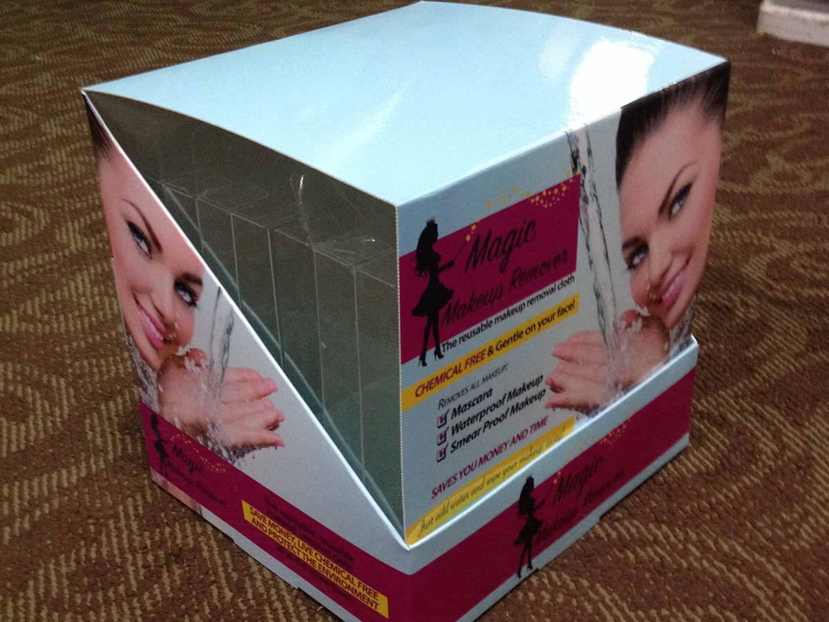
Compact displays are one of my favorite solutions for pharmacy projects because they force clear decisions. The designer cannot rely on huge graphics or oversized structures. Every inch must support shopper understanding.
Best-fit product types
This idea fits:
- Vitamin ranges
- Skin care series
- Oral care variants
- Pain relief product families
- Beauty tools
- Small packaged personal care
- Trial-size collections
Ideal store location
Compact SKU displays work well near category shelves, narrow aisles, checkout approaches, or secondary promotional zones. They are useful when the retailer gives the brand limited space.
Structural considerations
There are several common layouts:
| Layout | Best use | Watch-out |
|---|---|---|
| Vertical columns | Clear SKU comparison | Needs strong dividers |
| Tiered shelves | Small cartons or bottles | Shelf sag risk |
| Peg hooks | Hanging packs | Hook spacing and tear strength |
| Tray system | Small boxed items | Products may mix if dividers are weak |
| Half-pallet style | Higher volume | Larger footprint needs retailer approval |
Execution risk
The biggest risk is poor SKU logic. A display may hold all products, but shoppers may not understand the difference. I always suggest arranging variants by shopper need, not only by internal SKU code. For example, a skincare range can be grouped by concern, such as hydration, repair, or daily use.
Manufacturing details also matter. Small compartments require accurate die-cutting and stable folding. Peg hook displays need enough board strength around the hook holes. If the product swings or tears the board, the display will fail even if the artwork looks good.
Before choosing this design, brands should confirm product dimensions, expected quantity, retailer footprint, and whether the display ships flat or pre-packed.
Frequently Asked Questions
What makes pharmacy cardboard displays different from supermarket displays?
Pharmacy cardboard displays need faster trust signals, cleaner messaging, and clearer usage cues. Shoppers often compare products by need, benefit, and credibility. The display should support easy understanding without clutter. Brands should verify all product claims and retailer requirements before printing.
Which cardboard display is best for OTC product launches?
An educational floor display or compact shelf display usually works well for OTC launches. The best choice depends on product weight, number of SKUs, store location, and required explanation. I recommend testing the structure with real product before production.
Can cardboard displays hold heavy pharmacy products?
Yes, cardboard displays can hold heavier products if the structure is designed correctly. Shelf span, corrugated board grade, reinforcement, base size, and load distribution all matter. Buyers should provide real product weight and packaging dimensions before structural design starts.
Should pharmacy displays ship flat or pre-packed?
Flat shipping can reduce freight volume, but it requires simple in-store assembly. Pre-packed displays can save store labor, but they need stronger shipping protection. The best option depends on retailer requirements, delivery route, product fragility, and setup expectations.
How should brands choose between hooks, shelves, and trays?
Brands should choose by packaging type and shopper behavior. Hooks suit hanging packs. Shelves suit cartons and bottles. Trays suit small grouped items. The structure should keep products organized, easy to pick, and stable during normal store handling.
Conclusion
The best cardboard display ideas for pharmacies and drugstores start with the shopper task, not the display shape. A strong concept should match product education, seasonal timing, impulse behavior, replenishment needs, counter space, aisle visibility, or SKU grouping. In my work with custom cardboard display structure, production, printing, packing, and delivery communication, I have learned that manufacturability decides whether a creative idea works in-store. If you are planning a pharmacy or drugstore display project, I can help you evaluate the structure, load, packaging, and execution risk before production.
"Why Retail Pharmacy's Trust Challenge Is Also Its Path ...", https://www.pharmaceuticalcommerce.com/view/why-retail-pharmacy-s-trust-challenge-is-also-its-path-forward. Research on consumer health information behavior supports the view that clear and credible information is important in health-product decision-making; this evidence is contextual because it concerns health information use broadly rather than cardboard pharmacy displays specifically. Evidence role: general_support; source type: research. Supports: Health consumers rely on clear, trustworthy information when making decisions about medicines and health-related products.. Scope note: Contextual support rather than direct evidence about cardboard displays. ↩
"The Over-the-Counter Drug Facts Label", https://www.fda.gov/drugs/understanding-over-counter-medicines/over-counter-drug-facts-label. FDA guidance on nonprescription drug labeling indicates that OTC products require standardized information on uses, warnings, directions, and ingredients to support consumer self-selection and safe use; this supports the general need for clearer explanation but does not compare OTC products directly with snacks or household goods. Evidence role: general_support; source type: government. Supports: OTC medicines are regulated with required labeling intended to help consumers understand uses, warnings, directions, and active ingredients.. Scope note: Does not directly compare OTC products with other retail categories. ↩
"STUDY: POINT-OF-PURCHASE DISPLAY IMPACT ...", https://www.supermarketnews.com/grocery-operations/study-point-of-purchase-display-impact-increases. Eye-tracking and shopper-behavior studies show that retail attention to products and displays is brief and selective, supporting the need for concise benefit communication; the evidence supports the general time-pressure principle rather than proving a universal three-second threshold. Evidence role: general_support; source type: paper. Supports: Retail shoppers allocate limited visual attention to packages and displays, so concise benefit communication is important.. Scope note: The exact three-second figure may vary by category, store context, and shopper mission. ↩
"Flu Season | Influenza (Flu)", https://www.cdc.gov/flu/about/season.html. Public-health sources describe recurring seasonal patterns for influenza activity, pollen exposure, and ultraviolet exposure, supporting the view that related pharmacy promotions often operate within limited seasonal windows; this is contextual support and does not measure promotional sales timing directly. Evidence role: historical_context; source type: government. Supports: Cold and flu activity, allergy exposure, and sun-protection needs are associated with recurring seasonal patterns.. Scope note: Supports seasonality of health needs, not the commercial performance window of specific displays. ↩
"Human Factors in Forensic Science | NIST", https://www.nist.gov/forensic-science/human-factors-forensic-science. Human-factors research links task complexity, instruction clarity, and error likelihood in manual assembly tasks, supporting the operational concern that complex retail display setup can lead to incorrect assembly; the evidence is indirect because it is not specific to pharmacy cardboard displays. Evidence role: mechanism; source type: research. Supports: Task complexity and unclear instructions can increase the risk of human error during assembly or setup tasks.. Scope note: Indirect evidence from assembly and human-factors research. ↩
"Factors Affecting Impulse Buying Behavior of Consumers - PMC", https://pmc.ncbi.nlm.nih.gov/articles/PMC8206473/. Consumer-behavior literature treats impulse buying as dependent on store format, product category, and shopper goals, which supports the claim that pharmacy impulse purchases may differ from supermarket impulse purchases; this does not establish a single universal difference across all pharmacies and supermarkets. Evidence role: general_support; source type: paper. Supports: Impulse buying varies by retail format, product category, and shopper motivation.. Scope note: General support for format-dependent impulse behavior, not a direct comparison of every pharmacy and supermarket context. ↩
"impulse buying behaviour at the retail checkout", https://www.academia.edu/45180372/IMPULSE_BUYING_BEHAVIOUR_AT_THE_RETAIL_CHECKOUT_AN_INVESTIGATION_OF_SELECT_ANTECEDENTS. Retail impulse-buying studies identify point-of-purchase exposure and checkout-area placement as factors that can encourage unplanned purchases, supporting the use of compact displays near counters and queues; the evidence is general retail evidence rather than pharmacy-specific proof. Evidence role: general_support; source type: paper. Supports: Checkout and queue areas can increase exposure to small add-on products and are associated with impulse-purchase opportunities.. Scope note: General retail support, not direct pharmacy-only evidence. ↩
"On Shelf Availability: A Literature Review & Conceptual ...", https://scholarworks.uark.edu/cgi/viewcontent.cgi?article=1009&context=mktguht. Retail shelf-availability research shows that out-of-stock and poorly replenished conditions affect shopper experience and sales, supporting the concern that high-turnover display items can quickly appear empty or disorganized; this evidence addresses retail shelves broadly rather than cardboard displays alone. Evidence role: general_support; source type: research. Supports: Poor replenishment and out-of-stock conditions affect shelf presentation and shopper response.. Scope note: Applies to retail replenishment generally, not exclusively to temporary cardboard displays. ↩
"BRAND PLACEMENT AND CONSUMER CHOICE - PMC - NIH", https://pmc.ncbi.nlm.nih.gov/articles/PMC2741065/. Category-management and shopper-navigation research supports organizing related products together to aid search and comparison, which provides a rationale for placing replenishment displays near the relevant aisle; the evidence is contextual because it does not test the exact display format described. Evidence role: general_support; source type: research. Supports: Category adjacency and logical product grouping can support shopper navigation and comparison.. Scope note: Contextual support from category-management principles. ↩
"The Role of Advertising and Health Literacy - PMC", https://pmc.ncbi.nlm.nih.gov/articles/PMC13035253/. Health-communication research indicates that perceived credibility and persuasive tone influence trust in health-related messages, supporting the caution that aggressive pharmacy counter messaging may reduce trust; the evidence is contextual and does not directly test cardboard counter displays. Evidence role: general_support; source type: paper. Supports: Trust in health-related communication can be affected by perceived credibility, promotional tone, and risk perception.. Scope note: Contextual support from health-communication research. ↩
"The Influence of Clutter on Target Prevalence and Decision ...", https://repository.lsu.edu/cgi/viewcontent.cgi?article=6571&context=gradschool_theses. Visual-search research shows that clutter and competing stimuli can increase search time and reduce recognition efficiency, supporting the recommendation to keep aisle display messaging simple; the evidence concerns visual cognition generally rather than pharmacy displays specifically. Evidence role: mechanism; source type: paper. Supports: Visual clutter and competing information can slow visual search and recognition.. Scope note: Mechanistic support from visual cognition, not a direct field test in drugstores. ↩
"Why Do Cardboard Floor Displays Tip Over?", https://www.topwelldisplay.com/why-do-cardboard-floor-displays-tip-over/. Engineering mechanics explains that an object becomes unstable when its center of gravity falls outside its base of support, supporting the concern that a tall display with a narrow footprint can tip; this is a general physical principle rather than a test of a specific cardboard display design. Evidence role: mechanism; source type: education. Supports: An object's tipping stability depends on the relationship between its center of gravity and base of support.. Scope note: General engineering principle, not product-specific load testing. ↩
