Struggling to get your beverages noticed on crowded shelves? It's frustrating when great products are ignored. The right custom display1 can grab attention and boost your sales immediately.
An effective beverage display combines a strong structure, compelling graphics, and smart product placement. It must support the product's weight, communicate the brand's message, and make it easy for customers to grab a drink. This turns a simple holder into a powerful sales tool.

It’s easy to think a display is just a box to hold your products, but it’s so much more than that. I've spent years designing displays for brands big and small, and I've learned that the best ones are silent salespeople2, working 24/7 on the retail floor. They have to be engineered just as carefully as the product they're holding. To really understand what makes them work, we need to break down every single element. Let's look at what it takes to build a display that doesn't just sit there, but actively sells.
What Are the Primary Objectives of a Beverage Display?
Is your display just a product holder? You're missing a huge sales opportunity if it isn't actively selling. We design displays to be your best silent salesperson on the floor.
The primary objectives are to increase sales3, enhance brand visibility4, and attract new customers. It should interrupt the shopper's journey, communicate a clear message, and make the purchase decision easy and immediate.

When we start a new project, the first thing I ask a client is, "What do you want this display to do?" The answer helps us define the core objectives, which go far beyond simply holding cans or bottles. We see the display as a strategic tool with three main jobs.
Driving Impulse Purchases
Many beverage purchases are not planned. A customer is walking down an aisle, and a well-placed, attractive display can trigger an impulse buy. The goal here is to be disruptive in a good way. We design the display to stand out from the visual noise of the store, using bright colors, a unique shape, or a compelling offer. It needs to be easy for a customer to grab the product without thinking twice. The easier it is to take, the more likely the sale.
Building Brand Awareness
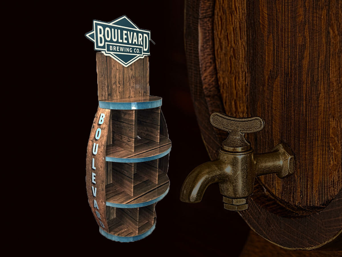
A display is a physical piece of your brand in the store. It's a 3D advertisement. Our job is to translate your brand's identity—your logo, colors, and message—onto a physical structure. For a new energy drink, the display might need to look exciting and modern. For an organic juice, it should feel natural and healthy. It's about telling your brand's story at a glance.
Announcing Promotions
Displays are perfect for highlighting special offers, new flavors, or seasonal campaigns. A "2 for $5" deal is much more effective when it's on a dedicated display rather than a small shelf tag. We design spaces for this messaging right into the structure.
| Objective | Key Design Focus | Desired Customer Action |
|---|---|---|
| Increase Sales | Easy access, clear pricing, compelling offer | Impulse purchase |
| Enhance Brand | Strong graphics, unique shape, quality materials | Brand recognition, trust |
| Promote Offers | Large callouts, dedicated graphic space | Take advantage of a deal |
How Do You Choose the Right Display Structure for Beverages?
Worried your beverage display might collapse? A weak structure is a disaster for your product and brand. Let's talk about choosing a strong, reliable foundation for your drinks.
Choose the structure based on product weight, quantity, and retail location. Floor displays are great for high-traffic areas, while counter displays5 work for impulse buys. The key is matching the form to its function and environment.

The structure is the skeleton of your display. If the skeleton is weak, the whole thing fails. I've seen it happen—displays sagging, tipping over, or just looking sad. This is why we spend so much time on structural design. The choice depends entirely on the product and the store. A 24-pack of soda for a big-box store like Costco has very different needs than a single-serve energy drink at a gas station.
Floor Displays
These are the workhorses. They are designed to hold a lot of product and grab attention from a distance.
- Pallet Displays: These are built on a standard pallet and can hold hundreds of pounds. They are perfect for warehouse clubs where products are moved by forklift. We design them to be shoppable from all four sides.
- Endcap Displays: These sit at the end of an aisle, a prime retail location. They need to be visually powerful to stop shoppers in their tracks. They must also fit the specific dimensions required by the retailer.
Counter Displays (PDQ Trays)
PDQ stands for "Product Displayed Quickly." These are smaller, pre-filled trays that sit on a checkout counter. They are perfect for encouraging last-minute impulse buys of single-serve items like energy shots, sodas, or bottled water. The design must be compact but still have a strong brand presence.
We use a simple table to guide the initial conversation with clients.
| Display Type | Best For | Retail Environment | Key Consideration |
|---|---|---|---|
| Pallet Display | Heavy, high-volume products | Warehouse Clubs (Costco, Sam's) | Extreme durability, forklift access |
| Endcap Display | Promotions, new products | Supermarkets (Walmart, Target) | Strict retailer dimensions, high visual impact |
| Counter Display | Single-serve, impulse items | Convenience Stores, Gas Stations | Small footprint, easy to grab from |
Which Materials Best Support Durability and Brand Image?
Does your current display look cheap? Flimsy materials can make even a premium beverage look bad. Let's explore materials that provide strength and project a quality brand image.
Corrugated cardboard is the best choice for most beverage displays. It's strong, lightweight, cost-effective, and highly customizable with printing. We use different flute strengths and coatings to match durability and branding needs.

The material you choose says a lot about your brand. For beverages, which are often heavy and sometimes refrigerated, the material choice is critical for both safety and perception. For over 95% of the beverage displays we create, the answer is corrugated cardboard6. But "cardboard" is a very general term. The magic is in the details—the specific type of corrugated board and the finishes we apply.
Understanding Corrugated Flutes
Corrugated board is made of a linerboard and a fluted medium. The size of these flutes determines the board's strength.
- B-Flute7: A good all-around choice. It provides a nice balance of strength and a smooth surface for printing high-quality graphics.
- C-Flute: Thicker and stronger than B-flute. We use this for heavier applications where stacking strength is important.
- BC Double-Wall8: This combines a B-flute and a C-flute layer. This is our go-to for heavy-duty pallet displays that need to hold hundreds of pounds of beverages. It's incredibly strong.
The Role of Coatings and Finishes
The finish is not just for looks; it adds protection. A gloss or matte lamination can protect the ink from scuffing and make the colors pop. For beverages that will be in coolers or open-air refrigerators, we always recommend a moisture-resistant coating. I remember a client with a chilled juice product; this coating prevented the cardboard from getting soggy and weak, saving the entire project.
| Material Spec | Primary Use | Benefit |
|---|---|---|
| B-Flute7 | Standard floor & counter displays5 | Good print surface, decent strength |
| BC Double-Wall8 | Heavy-duty pallet displays | Maximum load-bearing strength |
| Lamination | All high-end displays | Protects graphics, enhances appearance |
| Aqueous Coating | Chilled product displays | Resists moisture and condensation |
How Can Graphics and Visual Branding Enhance Beverage Displays?
Is your display blending in with the background? Generic or low-quality graphics make your product invisible. Great design makes people stop and look, turning a glance into a sale.
Graphics are your display's voice. They must use high-resolution images, brand-consistent colors, and clear, concise text. The design should tell a story, communicate benefits, and guide the customer's eye directly to the product.

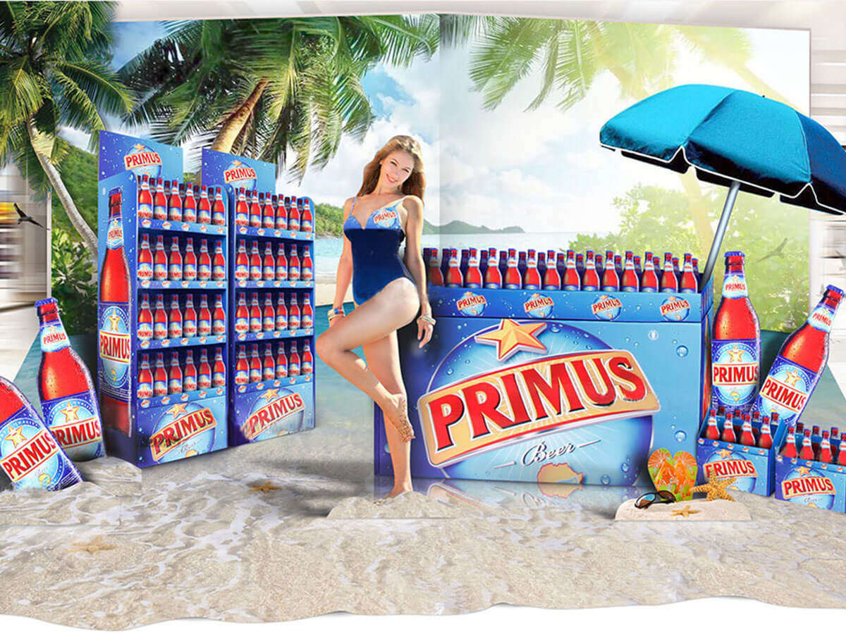
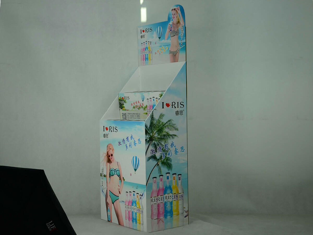
A display's structure provides the strength, but the graphics provide the personality. This is where we connect with the customer emotionally. A plain white box holding soda is just a box. But a box printed with images of a fun beach party, with vibrant brand colors and a bold logo, becomes an invitation. When we design the graphics, we focus on a few key areas to make sure they are effective.
High-Impact Visuals
People are drawn to images of people, desirable settings, or the product itself looking delicious. We always insist on high-resolution photography. A blurry or pixelated image makes a brand look unprofessional. The main header or back panel of the display is prime real estate for a "hero" image that captures the essence of the brand or campaign.
Clear and Simple Messaging
Shoppers are in a hurry. They are not going to read paragraphs of text. The messaging on a display needs to be short and powerful.
- Headline: A few words that grab attention (e.g., "The Ultimate Refreshment").
- Benefits: Three short bullet points are often enough (e.g., "Zero Sugar," "All Natural," "New Flavor").
- Call to Action: A simple instruction (e.g., "Try One Today!," "Stock Up Now").
I always tell my clients to think of the display like a billboard. You only have about three seconds to get your message across. We make every word and every image count to communicate the most important information quickly and effectively.
Why Does Color Psychology Matter in Beverage Display Design?
Are you using the right colors on your display? The wrong color choice can send a confusing message or, even worse, make your display completely invisible to your target customer.
Color psychology is crucial because colors evoke specific emotions and associations. Using the right colors helps to instantly communicate your brand's core message—like blue for refreshment9, green for health10, or red for energy11—and attract the right audience.

Color is the first thing a shopper's brain processes. Before they read a word or recognize a shape, they see color. That's why it's one of the most powerful tools we have in display design. It’s not just about making something look nice; it’s about sending a subconscious signal to the customer. We use color strategically to align the display with the product and the desired customer feeling.
Communicating Brand Attributes
Different colors trigger different feelings. When designing for a beverage brand, we have to match the color to the product's identity.
- Blue: Often used for water or sports drinks. It communicates purity, hydration, and refreshment.
- Green: Perfect for organic juices, teas, or health drinks. It signals nature, health, and wellness.
- Red: A high-energy color. It’s great for sodas, energy drinks, or promotional displays because it creates a sense of urgency and excitement. Think of Coca-Cola.
- Orange/Yellow: These colors are cheerful and optimistic. They work well for fruit juices and drinks associated with fun and summer.
Standing Out in the Retail Environment
We also consider the store environment itself. The aisles are a sea of different colors. Sometimes, the best strategy is to use a bold, contrasting color that will pop against the neutral store shelving and the competitor products. We analyze where the display will be placed to choose a color palette that won't get lost in the noise.
| Color | Common Association in Beverages | Good For |
|---|---|---|
| Blue | Refreshment, Purity, Calm | Bottled Water, Sports Drinks |
| Green | Natural, Healthy, Organic | Juices, Teas, Health Drinks |
| Red | Energy, Excitement, Urgency | Sodas, Energy Drinks, Promotions |
| Black | Premium, Sophisticated, Bold | High-End Mixers, Craft Sodas |
How Should Products Be Positioned for Maximum Visibility?
Are your products hard to see or reach on the display? If customers have to search or struggle to grab an item, you will lose the sale. Easy access is non-negotiable.
Products should be positioned at "eye level to buy level12," typically between the waist and shoulders of the average shopper. Use angled shelves13 or gravity-fed systems to ensure products are always at the front and easy to grab.

We can design the most beautiful, structurally sound display in the world, but if the product itself is placed poorly, it won't sell. Product positioning is a science, and we engineer our displays to make the product the hero. The goal is to present the beverage in a way that is both visually appealing and incredibly easy for the customer to purchase.
The "Strike Zone"
The most valuable real estate on any display is the area between a shopper's waist and their eyes. We call this the "strike zone." Products placed here are seen most easily and are most likely to be purchased. We always design our displays to present the primary product, like a new flavor or best-seller, directly in this zone. Less important items or backstock can go on the lower shelves.
Making It Easy to Grab
A customer should never have to work to get your product.
- Angled Shelves: For single bottles or cans, we often design shelves with a slight downward angle. This allows the products to slide forward automatically as one is taken.
- Scalloped Trays: These have curved cutouts that hold each bottle or can securely in place while still making them easy to lift out. This keeps the display looking neat and organized.
- Accessibility: We ensure there's enough space b
Discover how a custom display can make your beverage stand out and increase sales by attracting more customers. ↩
Learn how well-designed displays can work 24/7 to promote your products without any active selling. ↩
Explore strategies to boost sales through effective display design and placement in retail environments. ↩
Find out how displays can improve brand recognition and attract new customers in a crowded market. ↩
Find out how counter displays can increase impulse buys at checkout points with their strategic placement. ↩
Explore the benefits of using corrugated cardboard for strength, cost-effectiveness, and customization. ↩
Learn about the balance of strength and printability that B-Flute offers for beverage displays. ↩
Understand the superior strength and durability of BC Double-Wall for heavy-duty beverage displays. ↩
Explore the association of blue with purity and hydration, making it ideal for water and sports drinks. ↩
Understand how green conveys natural and healthy attributes, perfect for organic and health-focused beverages. ↩
See why red is effective for energy drinks and promotions, creating urgency and excitement. ↩
Learn about the importance of product placement at eye level to maximize visibility and sales. ↩
Discover how angled shelves ensure products are always at the front, making them easy to grab and purchase. ↩


